Stem and Leaf Plot
A stem-and-leaf plot shows data arranged by place value. To make a stem-and-leaf plot:
- Arrange the data in order
- List the stems in order in the first column. Typically, the stem is all but the last digit of each data point and the leaf is the last digit.
- For each stem, record the ones digits of each data value in order from least to greatest. Write these in the second column.
Let’s look at an example.
Here’s the data (numbers): 5, 7, 12, 15, 19, 21, 21, 25, 29, 30, 30, 33, 42 49
A stem and leaf plot for this data looks like this:

The numbers on the left are called the stem. In this example, the stem would be the tens place value. The numbers on the right are the leaves. The leaves would be the ones place value. Notice the two red numbers. These numbers represent the number 25.
Frequency Table
A frequency table is a common way to organize large amounts of data. A frequency table shows the number of times each item appears. It has a scale that includes all of the numbers in the data and an interval, which separates the scale into equal parts.
A frequency table has 3 columns: interval, tally, and frequency.
For example – Say you asked your classmates what type of pet they had. You would use a frequency table to collect the data.
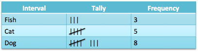
You count the data and make a tally mark in the tally column. Then you total the tally marks. This helps you to see where the data falls.
Histogram 
A frequency table can be used to create a histogram. A histogram is another way to display data using bars that have been organized into equal intervals. A histogram has the following characteristics:
- There is no space between bars.
- All of the bars have the same width (because the intervals are all equal).
- Intervals with a frequency of 0 don’t have a bar.
Line Graph 
A line graph compares changes over time. To draw a line graph:
- Draw and label the horizontal and vertical axes. Be sure to title the graph.
- Choose a scale and interval for the data and mark equal spaces on the vertical axis.
- Mark equal spaces on the horizontal axis and be sure to label the categories.
- Draw a dot to show the frequency in each category. Finally, draw a line to connect the dots.
Other graphs:


Below is the number of baseball games the students have attended:
7 8 8 9 9 10 10 12 16 21 22 29 29
| 0 | 7 8 8 9 9 |
|---|---|
| 1 | 0 0 2 6 |
| 2 | 1 2 9 9 |
Click the triangle to reveal the answer AFTER you calculate it yourself!
Use the data in the stem and leaf plot to calculate the mean. (If necessary, round the answer to the nearest tenth.)
14.6
Use the data in the stem and leaf plot to calculate the mode.
8, 9, 10, 29
The buyer for a chain of supermarkets created the following stem-leaf plot showing the number of kiwis at each of the stores.
| 0 | |
|---|---|
| 1 | 9 |
| 2 | |
| 3 | 0 1 2 |
| 4 | 5 5 8 8 9 |
| 5 | 0 1 4 5 |
| 6 | 3 |
How many grocery stores have more than 35 kiwis?
10
The government published the following stem-and-leaf plot showing the number of snakes at each major zoo in the country:
| 0 | 7 |
|---|---|
| 1 | 1 4 8 |
| 2 | 5 5 5 6 7 7 9 |
| 3 | |
| 4 |
How many zoos have exactly 27 snakes?
2
Gabriela wrote down how many yellow pairs of shoes she saw every day this week.

How many yellow pairs of shoes did she see on Friday?
3
Adapted from source